Stage 1 Visual Arts: Design
Assessment Type 2: Practical
Practitioners Statement: Practical 1
119885W
My brief was to design a logo for a band called Sticky Fingers, this was done by using negative space to create an eye catching design that relates to the bands genre and target audience.
The starting points for my design was my interest in music, Sticky Fingers especially. I have always looked at their current logo and wondered how it related to their personalities and the genre of their music and i realised that it didn't, this is when i started thinking of different ways to create a logo to represent them and so people know exactly who they are when they look at the logo. Some of my main influences were indie music bands, most of these bands have iconic logos that represent them and who they are such as 'Guns n Roses' in their logo they are both guns and roses which showcases who they are since they can be a heavy band - relating to the guns, or they can be a soft band that sings out love which relates to the roses. Most indie bands have their own unique logos that have some sort of symbol that either represents the band or the band name. This is what i focused on when i was creating my design, I wanted to showcase who Sticky Fingers were and have a piece of them in the logo.
My design involves a circle that represents a drum since the drums is a big part in the band since each song of the band has a completely different sound, i believe the instruments used such as the drums makes the band who they are and gives them their own unique sound. A sound wave is also incorporated at the top of the drum since the lyrics and the singer are one of the biggest components in the band, this is then followed by the bands name being put in the middle of the drum. To finish off the logo i believe the colour blue was the right colour to incorporate into he logo, the colour blue is a very relaxing and chill colour which is what the band is. All of these concepts bring the whole design together to make a functional and finish product that fits the design brief as it is eye catching by the contrast between the black and the light blue colours and also relates to the band and the target audience.
I had one main issue during the process of creating my design which was learning how to use photoshop and adobe as i have never used both of these previously. I found it challenging trying to work out what i was doing in photoshop, knowing what my limits were and trying to figure it out on my own.
Overall i believe my logo was a success. I had an idea of what my logo would look like at the beginning of the assignment, but looking at it now, it looks nothing like i had previously thought, it looks even better than i had ever imagined and i am proud of myself for completing it as i did struggle.
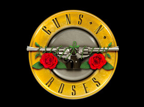
Inspiration 1: Guns n Roses
Current Logo
|
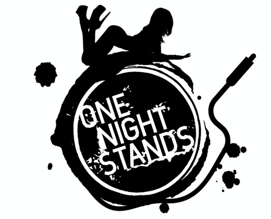
Inspiration 2: One Night Stands
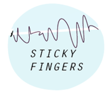
My Design
|
