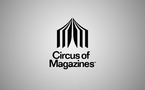
Logo 1: Circus of Magazines First Impressions:
This logo is for 'Circus of Magazines' which is an online company where you can buy, sell and swop magazines. Describe: This logo uses negative space to create the outline of a circus tent, it then uses positive space to then create it to look like an open magazine. It also features the name of the company which relates to the logo and so viewers know what the website is about. Analyse: The target audience for this logo would be anyone that is interested in magazines, this logo features very contrasting colours such as black, white and grey which means it is not gender specific. This logo is also modern as it is very simple and clean which then makes it more sophisticated and not really aimed at little kids or children. The colours don't match the title, most circus's and magazines are full of colour and happiness, but this logo is very dull with no colour which makes it feel cold. Interpret: The logo is communicating that the circus tent is an open magazine which relates back to the two words in the name of the logo. Evaluate: This logo successfully shows what the company is about. Logo 2: Cleaning and Handyman Services |
|
|
First Impressions:
This logo is promoting a company where you can hire a handyman or cleaning services. Describe: This logo uses negative space by using two hands that then form into the letter 'H'. The two hands relate to the 'handyman' part of the company and the 'H' relates to the 'H' in handyman. These work together to create the feel of the job and what it involves. This logo only uses the symbol, there is no name with it, only the use of the letter 'H'. Analyse: The target audience for this logo would be for anyone that is interested in hiring a handyman or a cleaner, so this might be for a business who is looking for someone to come clean or to fix something, elderly people who cannot cope with cleaning or anyone who needs something fixed. This logo also uses contrasting colours which are the white and the black, which then makes it feel very sophisticated and simple, but then with the round hands and the roundness of the letter, it takes the seriousness out of it and makes it feel more warmer and friendlier. Interpret: This logo is communicating that the two hands mean 'handyman' and a hands on job and the letter also relates to the purpose of the job. Evaluate: This logo is authentically pleasing and does successfully communicate what the business is about. |
|
Logo 3: American Institute of Architects First Impressions:
This logo is promoting a company called "American Institute of Architects Center Logo" this center provides resources to the public and professionals to use. This center offers specials events, programs and exhibitions. Describe: This logo uses the use of negative space by putting New York's city landscape on an image of a key, they used New York City since the company is based in that city. This style of logo uses only the imagine to show what they do and what sort of business they are. The landscape on the key also relate to 'Architecture' since its all about building and designs of buildings. Analyse: The target audience for this logo would be anyone that is interested in architects. This logo is also using contrast colours which is black and white, which again makes it feel sophisticated, simple and classy. Interpret: This logo is communicating that the buildings in the key relate to the architect in the name. Evaluate: This logo is authentically pleasing and also successfully shows what the company is about in a simple but sophisticated way. |
|
